UX/UI DESIGN · REAL ESTATE TECH
Agent App: Redesigning the Lead Dashboard to Drive Follow-Up Action
COMPANY
Real Geeks
ROLE
Lead Designer
EXPERTISE
UX/UI Design · UX Research · AI-Assisted Ideation · Prototyping
YEAR
2026
In lead-based sales, speed is the lever. A Harvard Business Review analysis of 2.24M leads found that contacting a prospect within an hour made firms ~7x more likely to qualify the lead than waiting just 60 minutes longer (Oldroyd et al., HBR). The existing dashboard worked against that reality - the next action competed with four other elements for attention.

This wasn't a ground-up rebuild, and that was the hard part. The job was to find the highest-leverage changes inside an existing product. Sharpening clarity, hierarchy, and actionability - without disrupting the muscle memory agents already relied on.
That created a real tension to design against:
Change enough to meaningfully improve the daily experience
But not so much that agents face friction or a relearning curve
While making follow-up feel urgent, organized, and completable - not like one more thing competing for attention
The deeper challenge underneath all of it: agents weren't avoiding follow-up because they didn't care. They were avoiding it because the app made the most important moment of their day harder than a sticky note.
Before committing to a direction, I went back to the people who live in the app every day.
I interviewed three Real Geeks agents spanning different tech comfort levels and workflow styles, focused on one question: how do they actually work their leads across mobile and desktop, and where does the current app get in the way? Three is a small sample, but it was deliberately targeted - these were active daily users, and the patterns converged fast.
What came through consistently:
Follow-ups were buried on mobile and disconnected from how agents actually call. Agents were defaulting to desktop or leaving the app entirely - not because mobile was wrong for the job, but because the experience hadn't caught up to their workflow.
Agents wanted to know the type of action before clicking in. A call, a text, and an email demand different energy and timing, but the app made them all look the same.
The dashboard felt cluttered - too many equal-weight panels competing for attention, with nothing signaling what mattered most.
Follow-up felt labor-intensive enough that agents abandoned it, falling back on mental notes and third-party to-do apps - which is exactly where leads slip through the cracks.
One direction resonated with all three: a cleaner, consolidated layout built around hot vs. warm leads with fewer categories to wade through.
Rapid ideation with AI-assisted tools. With clear signal from research, I used AI-powered tools - Stitch, Visily, and Figma Make to generate and pressure-test multiple layout directions before investing in high-fidelity work. This let me explore hierarchy and information density across four distinct concepts without building each from scratch. The point wasn't speed for its own sake; it was widening the solution space so the real decision could be made with more options on the table and actual user input driving the call, not my assumptions.
Then I let the agents decide. I put four directions (V1–V4) in front of them - varying in density, hierarchy, and visual style and asked which they'd most want to open every morning. V1 won decisively (4 stars) for its clean two-panel lead summary, follow-up type breakdowns, and familiar structure that felt immediately actionable without being overwhelming. V2 earned two stars for its data depth; V3 and V4 informed details but didn't win the room. V1 became the foundation, validated by the people who'd actually use it, not by me.


Every decision traced back to something an agent told me.
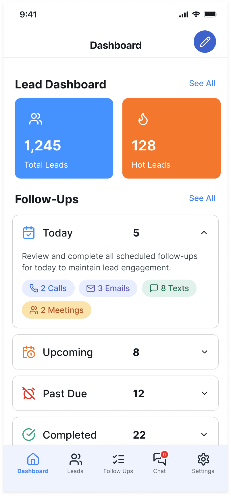
1. Consolidate the stat panels from four to two. Research signal: agents said the four equal-weight panels created visual competition with no clear priority. The redesign reduces them to two modernized panels - Total Leads and Hot Leads - giving an immediate read on what matters most. Tradeoff: less data at a glance, but a cleaner entry point that doesn't split attention before agents even reach their follow-ups.
2. Surface follow-up type breakdowns. Research signal: agents wanted to know whether a follow-up was a call, text, email, or meeting before tapping in. The original Today / Upcoming / Past Due tabs showed only counts. The redesign breaks each category down by action type. Tradeoff: more information on the dashboard, but structured to reduce decision fatigue rather than add to it.
3. Build out the follow-up detail view. Research signal: follow-up felt labor-intensive enough to abandon. Tapping a category now opens a full list with filters, due dates, inline action buttons (Call, Text, Email), edit capability, and a mark-complete checkbox - all in one flow, instead of forcing agents to navigate away from the dashboard to act. Tradeoff: more depth in the detail view, but this is where agents are actively working, so depth is expected and earns its place.
1. Audit the existing experience. I mapped the current dashboard flow - where agents made unnecessary decisions, where context was missing, and where simple actions took too many steps.
2. Identify the high-leverage gaps. Rather than redesigning everything, I prioritized the follow-up section as the highest-friction, highest-value area - the place agent productivity either succeeds or stalls every single day.
3. Prototype in Figma. I built a clickable prototype of the new dashboard and detail view, focused on hierarchy, type-level transparency, and inline action.
4. Refine the panel structure. I worked through several layout iterations on the stat panels before landing on the two-panel approach, testing which metric combinations gave agents the clearest read on pipeline health at a glance.
Before - Dashboard Four equal-weight stat panels competed for attention. The follow-up section listed Today / Upcoming / Past Due as raw counts, with no signal about what kind of action each required.


After - Dashboard Two modernized lead panels anchor the top. Each follow-up category now breaks down by type - calls, texts, emails, meetings so agents know exactly what their day demands before they tap anything.
After - Follow-up detail Tapping any category opens a full list with filter and type controls, lead name, task description, due date, an inline action button (Call / Text / Email), an edit link, and a mark-complete checkbox - one uninterrupted flow where agents used to be forced out of the app entirely.


The best dashboard redesigns don't just look cleaner, they make the right next action obvious. This project was about removing the cognitive load between an agent opening the app and knowing exactly who to contact, how, and when.
A strong UX designer finds those gaps in an existing product and closes them precisely, without burning the whole thing down to do it.
Because the redesign is pre-launch, the real proof comes at deployment. The metric I'll be watching is follow-up completion on mobile - whether agents stop defaulting to desktop and third-party to-do apps and start trusting the app to run their day. That's the behavior the whole redesign is built to change.