Tinderized Home Search — Transforming browsing into a guided, intuitive journey
UX/UI DESIGN
Traditional home search UIs often feel mechanical — endless filters, dense grids, and transactional interfaces that push cognitive load onto the user. Instead of helping people discover the right home, many platforms force them into a spreadsheet-like journey.
This leads to:
Decision fatigue
Low emotional engagement
Drop-off during discovery
Unclear signal about true user preferences
Yet we know from other industries (like dating apps) that simple, intuitive decision loops can reveal user intent quickly — while keeping the experience feel light, personal, and enjoyable.
I introduced a swipe-based, gamified experience modeled after dating interactions — a lighter, more emotional way to help people express preference and discover homes without wading through filters.
The swipe model would:
Turn browsing into an intuitive gesture
Give users a sense of momentum, not overwhelm
Improve signal quality by capturing real-time preference data
Create a more joyful and continuous narrative through the home discovery journey
Help the platform refine and personalize listings automatically
This was not a novelty feature — it was a UX reframing of how people choose homes.


This project originated as a single-day timed workshop challenge:
Only 8 hours from ideation → prototype
No engineering resources
Must fit within existing brand and product foundations
Required high-level clarity and compelling storytelling for stakeholder buy-in
The goal: Produce something innovative enough to excite leadership, yet feasible enough to integrate into our real product roadmap.


1. Opportunity Framing
I started by identifying emotional and functional gaps in the existing search journey:
Overload from dense lists
Lack of personalization
Motivation drop-off
Users feeling the experience was work, not discovery
These insights came from recent customer feedback surveys, highlighting a widespread appetite for a more human and intuitive search flow.
2. Rapid Brainstorming & Alignment
In a small workshop team, we collaboratively explored:
Alternative mental models for search
Patterns from motivational and gamified UX
Ways to simplify action loops without hiding necessary information
From this, the swipe model emerged as the strongest contender.
3. Low-Fidelity Exploration
To avoid over-investing in visual polish too early, I sketched out:
Swipe card interactions
Preference capture moments
Empty states and edge cases
How the system learns and adapts
“Just enough” detail to test usability quickly
These sketches formed the backbone of the interaction pattern.
4. Iterative Mid-Fidelity Prototyping
I progressively refined the prototype around:
Information hierarchy (what matters most in a single-card view)
Consistent swipe logic
How to reveal detail without breaking the simplicity
How filters could expand in future versions
I aimed for a balance of visual calm + high clarity + emotional momentum.
5. Stakeholder Feedback & Real-World Insight
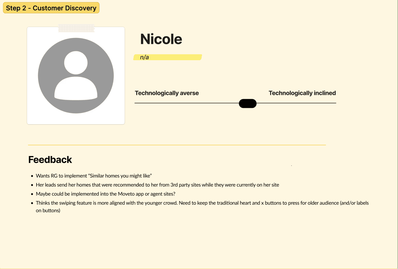
Two months later, I presented the concept at the Real Growth Summit in Dallas.
I tested the prototype with top agents — gathering feedback directly on what mattered most to them:
The level of detail shown on the swipe cards
What signals were valuable to them as agents
What buyers need to feel confident
Where the feature should live within the larger ecosystem
Their insights influenced updates to:
Feature prioritization
Data surfaced per card
Placement of “need-to-know-before-swiping” info
Next steps for future refinement
This validation step turned a workshop concept into a viable product direction.


The Tinderized Home Search concept delivers:
A fun, light, emotionally engaging way to browse homes
Personalized results that improve with each swipe
Lower cognitive load and fewer dead ends
A smoother path into deeper exploration and decision-making
And most importantly — it reframes home search as discovery, not work.